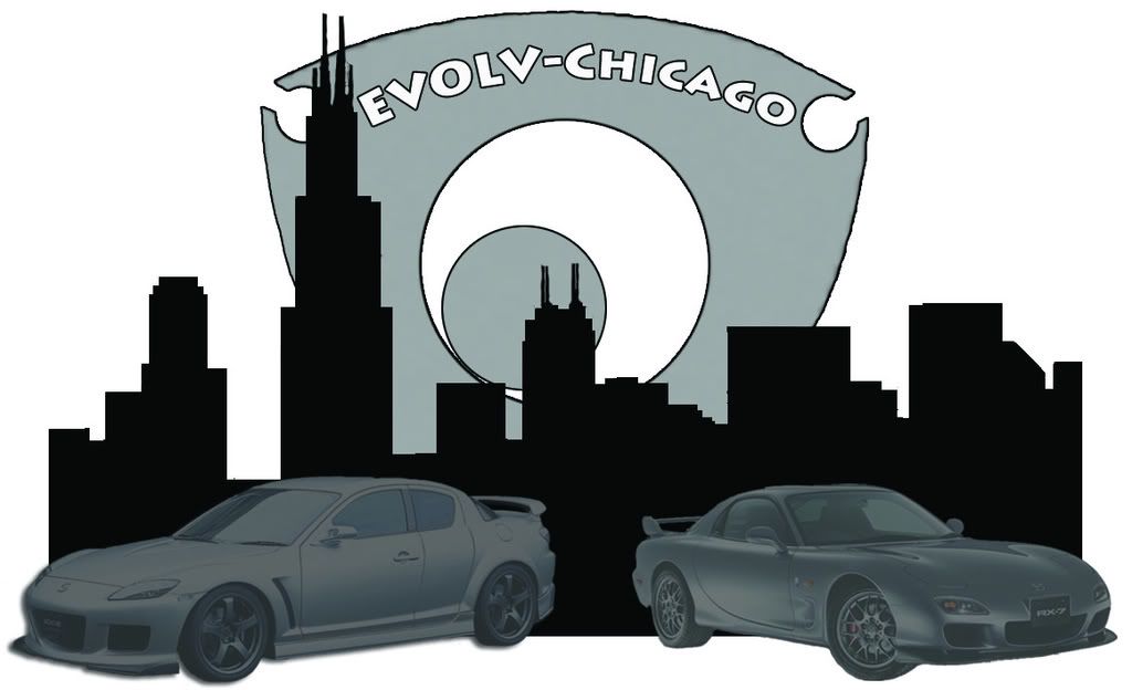
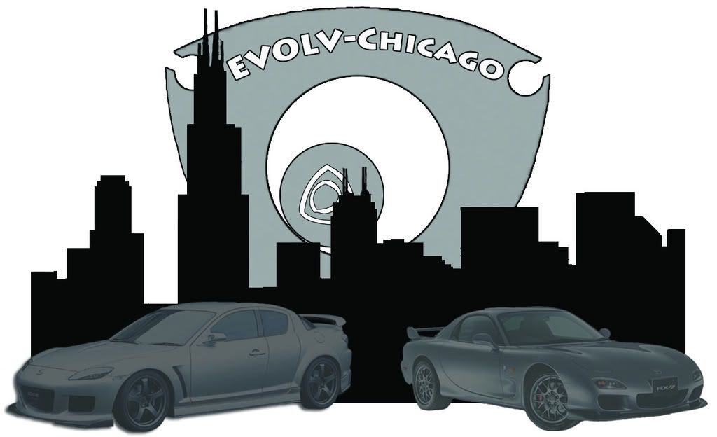
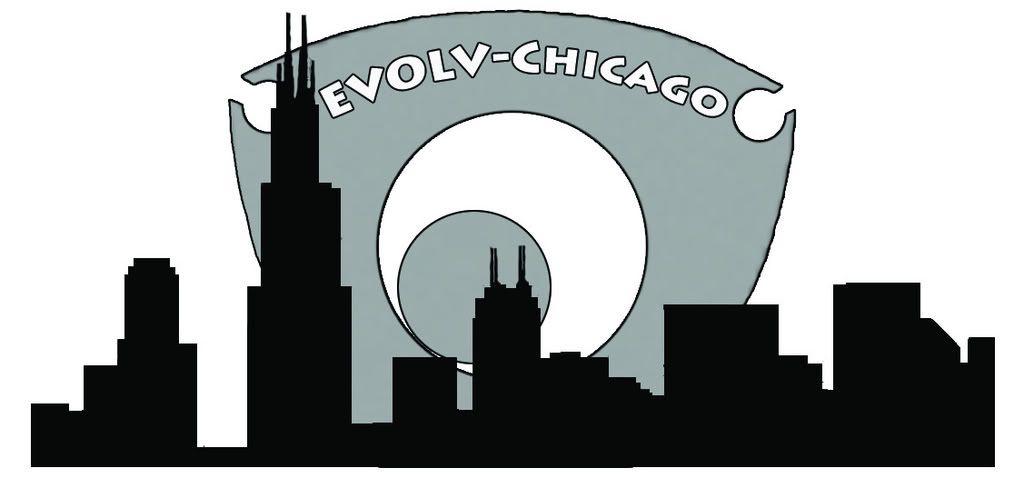
EVOLV-Chicago Logo Contest. Entries due 3/31/08!
#1
OK folks, we've asked for your entries for the logo contest. Here's the place to submit them.
All entries are due 3/31/08.
Designs must be high-resolution and scalable so that we can submit them to our store for reproduction. Please feel free to submit as many ideas as you'd like!
Winner of this contest gets a genuine Mazda goodie!!!!
+++++
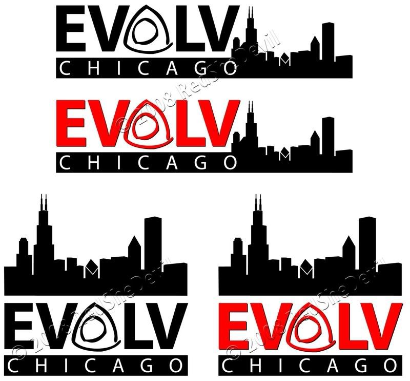
Submitted by: RedSheDevil
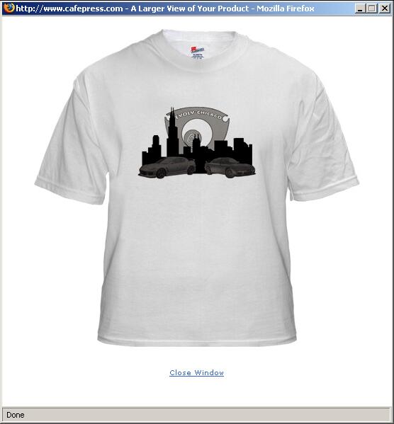
(I submitted a couple of options for the same design. This will allow for letting it appear on stickers, t-shirts, etc. and still look similar)

Last edited by RedSheDevil; 03-27-2008 at 07:08 PM.
#4
Awesome guys ... keep em coming! And I don't mind anyone using elements from my submission ... if your design gets chosen I can send you the native file to use for the final logo.
FYI gradients (fades) won't reproduce on silkscreened items like stickers/t-shirts.
FYI gradients (fades) won't reproduce on silkscreened items like stickers/t-shirts.
#5
Restiller: I really like the rotor/letters thing. I just can't get past reading CUOCU instead of EVOLV ... wonder if there's a way to make it more obvious that it's EVOLV?
#6
^^Yeah that's the main thing i hate about my submission. I tried turning them just right, but I see the same thing if I think about it too much. I should've taken a typography class lol! I like the fact that your logo says everything.
That's why I did the 1st and 4th one down with "EVOLV-Chicago" right underneath it to kinda decipher the logo. As if someone would take second deeper look and say "OH I just now noticed those triangle wedges say EVOLV!" But there's nothing about it that says Chicago. I don't have any vectors of the Chicago skyline, but I was thinking of putting one behind the logo or a Sears Tower vector inside the complete rotor.
I can email a pdf if someone wants to futz with my logo (preferably on illustrator).
#7
I was thinking of other ways we could use the rotors as text and this is what I came up with. We could use the rotors from restiller (Personally, I like those better) but I wanted to get the thought up there before the deadline. Had to post as a pdf as I can't get to photobucket from work.
#8
#9
If you want to know everything there is to know about what files will work well and why, check out this link that explains a lot of what works: http://www.cafepress.com/cp/info/sel...es/help_images
Just a note from your resident graphic designer! (Gawd, my personal and professional life finally meet!)
#10
Never mind ... I thought these things were silkscreened, but they use dye sublimation instead. So, gradients will work, but they need to be high resolution files (300dpi). You can check the resolution in Photoshop easily to see if the files are high enough resolution. Just open the image and go to Image>Image Size. Check the box at the bottom marked Constrain Proportions only. Uncheck Resample Image. Now plug the actual final size of the image into the Width/Height under Document Size (T-shirt logo sizes are 10" x 10" so you can use that as a standard to check). If the resolution is close to 300 pixels/inch, you are good to go!
If you want to know everything there is to know about what files will work well and why, check out this link that explains a lot of what works: http://www.cafepress.com/cp/info/sel...es/help_images
Just a note from your resident graphic designer! (Gawd, my personal and professional life finally meet!)
EDIT:
It is 300 dpi, but only about 4 inches. I resized it to 10 inches wide and now I have a 50 Mb file
Last edited by Aero8; 03-31-2008 at 12:06 PM.
#11
 Resizing just to get the numbers right will do nothing for the resolution. It will just make it blurry. Always start with a photoshop file at 300dpi at the final size, then check your images as you add them. If an image isn't high enough res, you just need to find another file.
I explain this stuff to clients almost every day, so don't feel bad if you didn't know about this. It's one of those things that doesn't make sense (Client: "It looks fine on my screen, it'll be fine when printed." Me: "You won't be happy with the results, lemme get you a sample." <presents sample> Client: "Oh, how come you didn't tell me it would look so crappy?" Me:
 )
)
#12
OK, don't do that  Resizing just to get the numbers right will do nothing for the resolution. It will just make it blurry. Always start with a photoshop file at 300dpi at the final size, then check your images as you add them. If an image isn't high enough res, you just need to find another file.
I explain this stuff to clients almost every day, so don't feel bad if you didn't know about this. It's one of those things that doesn't make sense (Client: "It looks fine on my screen, it'll be fine when printed." Me: "You won't be happy with the results, lemme get you a sample." <presents sample> Client: "Oh, how come you didn't tell me it would look so crappy?" Me: )
)
 Resizing just to get the numbers right will do nothing for the resolution. It will just make it blurry. Always start with a photoshop file at 300dpi at the final size, then check your images as you add them. If an image isn't high enough res, you just need to find another file.
I explain this stuff to clients almost every day, so don't feel bad if you didn't know about this. It's one of those things that doesn't make sense (Client: "It looks fine on my screen, it'll be fine when printed." Me: "You won't be happy with the results, lemme get you a sample." <presents sample> Client: "Oh, how come you didn't tell me it would look so crappy?" Me:
 )
)I may not be experienced in photoshop but I do understand res and resizing. I was impressed though, I've never used a program that actually resampled the image rather than just blowing it up. (I'm sheltered)
I did learn this morning that the color needs to be RGB to be able to save as a PNG.
#13
Registered User
Joined: Jun 2002
Posts: 3,086
Likes: 1
From: Misinformation Director - Evolv Chicago
OK folks, we've asked for your entries for the logo contest. Here's the place to submit them.
All entries are due 3/31/08.
Designs must be high-resolution and scalable so that we can submit them to our store for reproduction. Please feel free to submit as many ideas as you'd like!
Winner of this contest gets a genuine Mazda goodie!!!!
All entries are due 3/31/08.
Designs must be high-resolution and scalable so that we can submit them to our store for reproduction. Please feel free to submit as many ideas as you'd like!
Winner of this contest gets a genuine Mazda goodie!!!!
#14
HAHA, I should have expanded on my sentence. I'm not a complete n00b to imaging, just photoshop. I did the resizing just to play around. I wanted to see how large an uncompressed file would be. TIFF came out to be 74 MB
I may not be experienced in photoshop but I do understand res and resizing. I was impressed though, I've never used a program that actually resampled the image rather than just blowing it up. (I'm sheltered)
I did learn this morning that the color needs to be RGB to be able to save as a PNG.
I may not be experienced in photoshop but I do understand res and resizing. I was impressed though, I've never used a program that actually resampled the image rather than just blowing it up. (I'm sheltered)
I did learn this morning that the color needs to be RGB to be able to save as a PNG.

I'm just writing this stuff generically in hopes to save someone time if they're going to submit a logo. It's easier to post it publicly vs PMing everyone (cuz I'm lazy).
#16
Registered User
Joined: Jun 2002
Posts: 3,086
Likes: 1
From: Misinformation Director - Evolv Chicago
#17
#19
OK folks, the contest is officially over. Falken, if you can get me some ideas in the next couple of days we can probably get you in on the contest. Anyone else wanting to enter, please post here that you are working on something ... we'll see what we can do!
#21
OK folks, entries are no longer being accepted. All registered EVOLV-Chicago members will be receiving an email to vote from. If you do not receive an email, please PM me your updated email address.
Thanks to all who submitted entries!!! Only 3 years to get a logo ... we are on the ball!

Thanks to all who submitted entries!!! Only 3 years to get a logo ... we are on the ball!

#25
Sorry Bravery, the entries were due on March 31st. The voting has already started.
Be sure to keep this though, as we can probably use it on a t-shirt or something in the future!
Be sure to keep this though, as we can probably use it on a t-shirt or something in the future!


