Notices

todays project...

Thread Tools
 
Search this Thread
 
Rate Thread
 
Old 07-10-2010 | 06:49 PM
  #1  
MazdaRX-8SPEED's Avatar
Thread Starter
White Eagle
 
Joined: Mar 2009
Posts: 129
Likes: 0
From: Denver
Cool todays project...

so i was bored today and the silver strips in the center were all scratched up, so i decided to renew them and i also decided to get rid of the piano black... haha

todays project...-photo0201.jpg

todays project...-photo0202.jpg

todays project...-photo0203.jpg

todays project...-photo0206.jpg
Old 07-10-2010 | 06:53 PM
  #2  
Twiztog43's Avatar
Registered
iTrader: (15)
 
Joined: Aug 2006
Posts: 1,052
Likes: 3
From: Las Vegas
the power controls look ok, but the center dash looks a bit tacky, just stands out way to much.
Old 07-10-2010 | 07:00 PM
  #3  
rx 8speciale's Avatar
Relax baby!
iTrader: (3)
 
Joined: Oct 2008
Posts: 1,006
Likes: 0
From: Nurburgring driver, Germany
good job i like i
Old 07-10-2010 | 07:04 PM
  #4  
laythor's Avatar
I zoom therefore I am.
 
Joined: Mar 2007
Posts: 4,919
Likes: 12
From: San Jose, CA
Name:  NotSureIfWant.jpg
Views: 25
Size:  38.9 KB
Old 07-10-2010 | 07:23 PM
  #5  
Specialpowers's Avatar
Medic-8-'d
 
Joined: Aug 2009
Posts: 160
Likes: 0
Good effort.

I like the idea, but I agree that the centre console stands out a bit too much.

Would be great if you could extend the silver theme along the entire centre section.

Similar to this (but not so wacky!):
Attached Thumbnails todays project...-3489813965_2dccb5de3c.jpg   todays project...-rea-8-10.jpg  
Old 07-10-2010 | 08:21 PM
  #6  
Twiztog43's Avatar
Registered
iTrader: (15)
 
Joined: Aug 2006
Posts: 1,052
Likes: 3
From: Las Vegas
that doesnt look that bad, but the studs look way to tacky!!! just ruins the whole interior!
Old 07-10-2010 | 08:38 PM
  #7  
MazdaRX-8SPEED's Avatar
Thread Starter
White Eagle
 
Joined: Mar 2009
Posts: 129
Likes: 0
From: Denver
ya in my head it looked good, but when i did it it looked a little too by itself with the center. i might extend the silver up to the windsheid like in the pics above, just get the part where the navi supposed to go.. haha

edit: maybe to help it blend in more. i might paint the ***** on the air screens right above it. i mean in person it looks way better cause when in the car you have the center, side controls, mid strips, shifter ring, and the circles around the air duct things (idk what they are called) are silver. but yes i will work on getting the center to blend in more.

Last edited by MazdaRX-8SPEED; 07-10-2010 at 08:42 PM.
Old 07-10-2010 | 10:40 PM
  #8  
perks11's Avatar
HEADTURNER
 
Joined: Jan 2007
Posts: 1,100
Likes: 0
From: University of Missouri & STL
not sure im feelin the tv in the console between the back seats
Old 07-11-2010 | 12:29 AM
  #9  
Specialpowers's Avatar
Medic-8-'d
 
Joined: Aug 2009
Posts: 160
Likes: 0
Originally Posted by perks11
not sure im feelin the tv in the console between the back seats
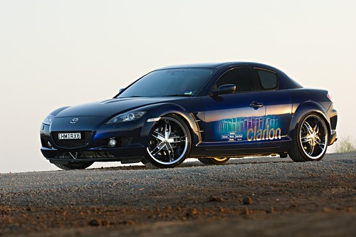
That first pic's of the rear of the Clarion RX8


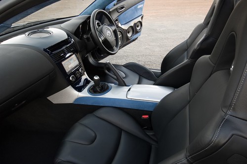
This is the front of the cabin


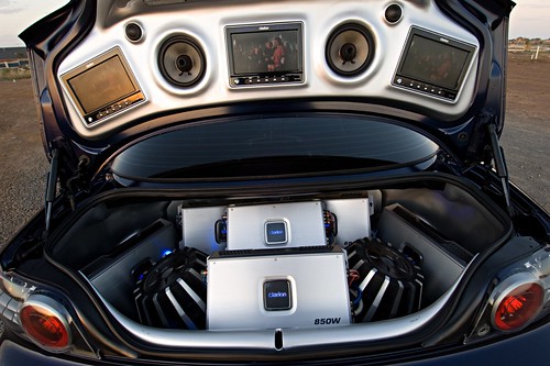
... and the boot

Old 07-11-2010 | 03:53 PM
  #10  
perks11's Avatar
HEADTURNER
 
Joined: Jan 2007
Posts: 1,100
Likes: 0
From: University of Missouri & STL
never mind if its a show car i completely understand it, that makes sense then
Related Topics
Thread
Thread Starter
Forum
Replies
Last Post
200.mph
RX-8 Parts For Sale/Wanted
462
12-10-2018 04:49 PM
Racingjunkie
Series I Wheels, Tires, Brakes & Suspension
2
09-29-2015 06:05 PM
Tweaked Tay
Series I Trouble Shooting
10
09-25-2015 08:54 AM
Juan Montenegro
New Member Forum
3
09-10-2015 07:28 PM


You have already rated this thread Rating: Thread Rating: 0 votes,  average.


All times are GMT -5. The time now is 07:16 AM.